How to Make Your Survey Results Visually Compelling
Charts, graphs, and infographics make visually compelling, engaging, shareable content.You designed your survey, you found your audience, you got your results – you may have even filtered them by age/question to dig deeper into the audience you’ve surveyed – but now you need to present the results.
What are the options?
You can share the results page, but if your audience isn’t as sophisticated in the analysis, or if you want to make a particular point clear, you need to develop a visually compelling way to summarize your key points.
You can export your data to Excel and create charts and graphs, but that can take time – and requires sorting the data, adding labels, copying into PowerPoint or Keynote. And, as with many survey questions, you may still want to create a summary statement, or call out one specific stat, such as:
79% of those surveyed won’t change their usage of a ride-hailing company based upon their logo.
It’s accurate. But not very visually appealing.
Enter Infographics.
Infographics tell a compelling story in a fun, engaging way – without a lot of heavy reading. And since most of us are visual learners, it’s a natural way for us to process information.
The same statement as above, shown here: 
Our friends at Venngage have a simple tool to help you create infographics, and an easy 5-step process for telling the right story in an infographic.
Comparing an infographic to raw data
For the sake of comparison, take a look at the complete results page of our Uber logo survey, or a snapshot of the results:
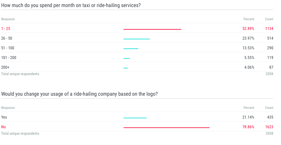 The results page provides a detailed analysis of the way people responded. It also provides a very powerful tool to sort data, filter by answer/question – even age, gender and location.
However, to highlight the point you want your readers to take home – without them having to sift through the data, you can create an infographic: